Challenge
The main challenge in this project was that users found the betting process difficult to understand and perceived the app as lacking visual appeal.
Design Process
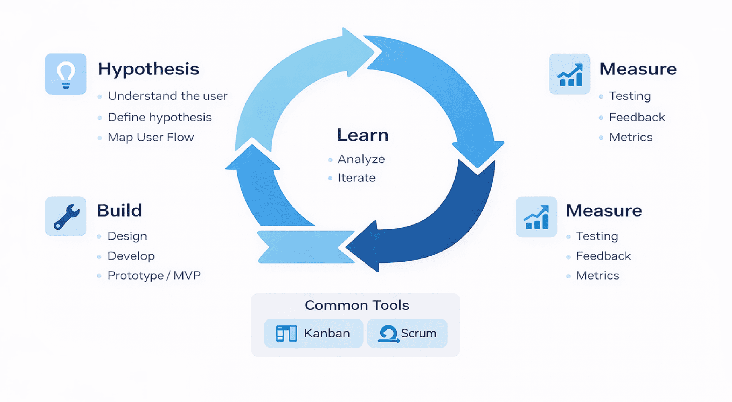
Implemented Lean UX to enable fast, iterative delivery and continuous learning, driving ongoing feature evolution in a complex global environment.
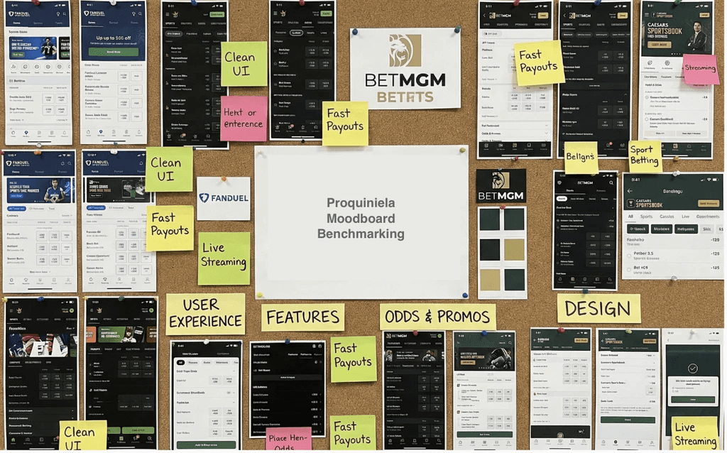
Benchmarking
Benchmarking played a key role, this insight helped inform design decisions around navigation, information hierarchy, and visual styling, ensuring the experience felt familiar and intuitive to users.
Additionally, benchmarking revealed gaps and opportunities for differentiation, allowing the product to stand out while still aligning with established usability principles.
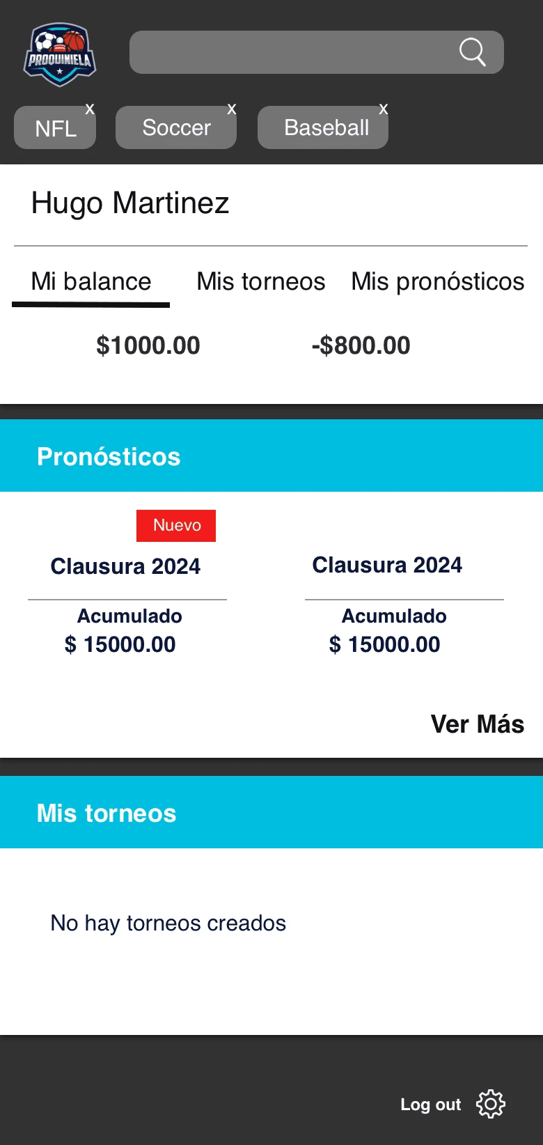
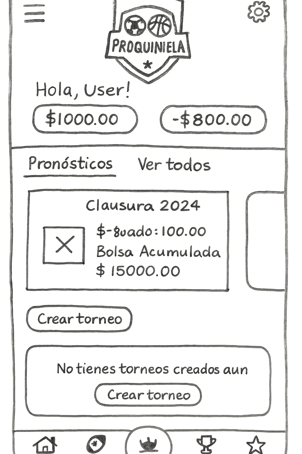
From mvp design*
User interviews
Using the MVP provided by stakeholders as a foundation, users were interviewed to better understand their needs, behaviors, and pain points. These sessions provided valuable qualitative insights into how users interacted with the product, highlighting areas of confusion and opportunities for improvement.
40%
High drop-off rate
6/10
struggled to navigate key flows
70%
Lack of visual appeal in the UI
UI Design
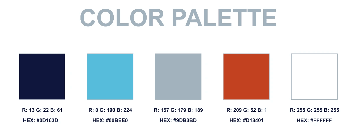
UI components and the visual style were designed in alignment with the existing brand identity, particularly the logo, while also incorporating user preferences identified during research.
This approach ensured visual consistency across the product while enhancing usability and appeal. Design decisions around color, typography, and component behavior were guided by both brand guidelines and user expectations, resulting in a more cohesive and engaging interface.

Proquiniela
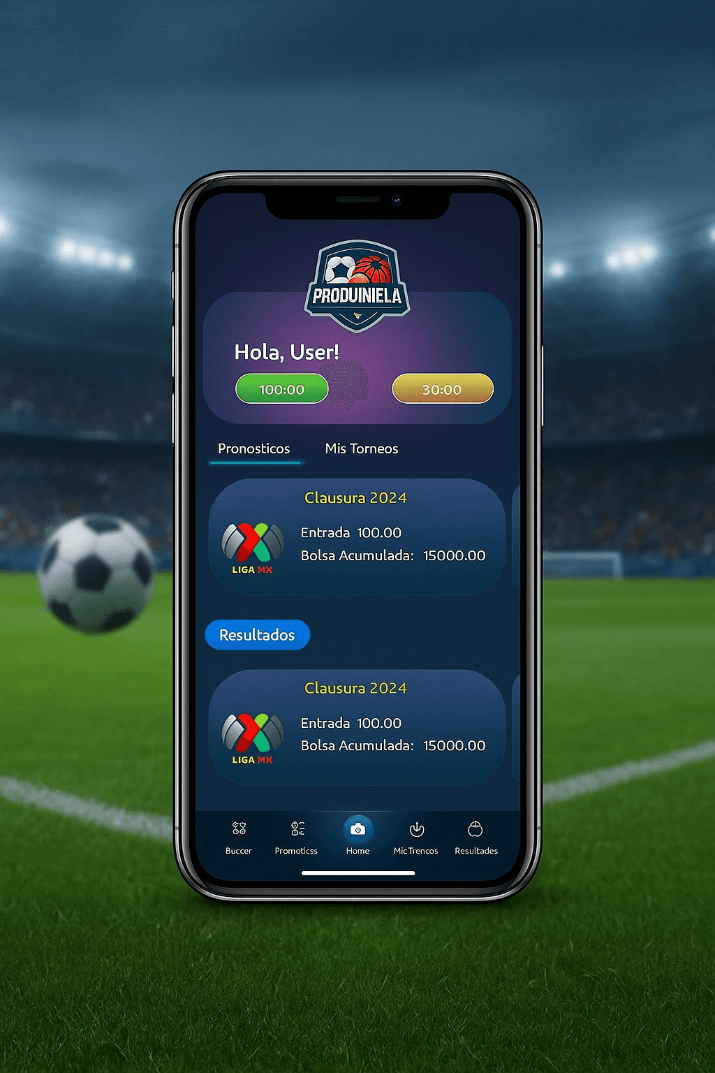
The Proquiniela app allows users to participate in sports prediction games directly from their mobile devices. Users make predictions on match outcomes and compete for points or prizes, either in official contests or casually with friends.
Role: UI/UX
Tools: Figma
Industry: Gaming / Sports betting
Final Designs
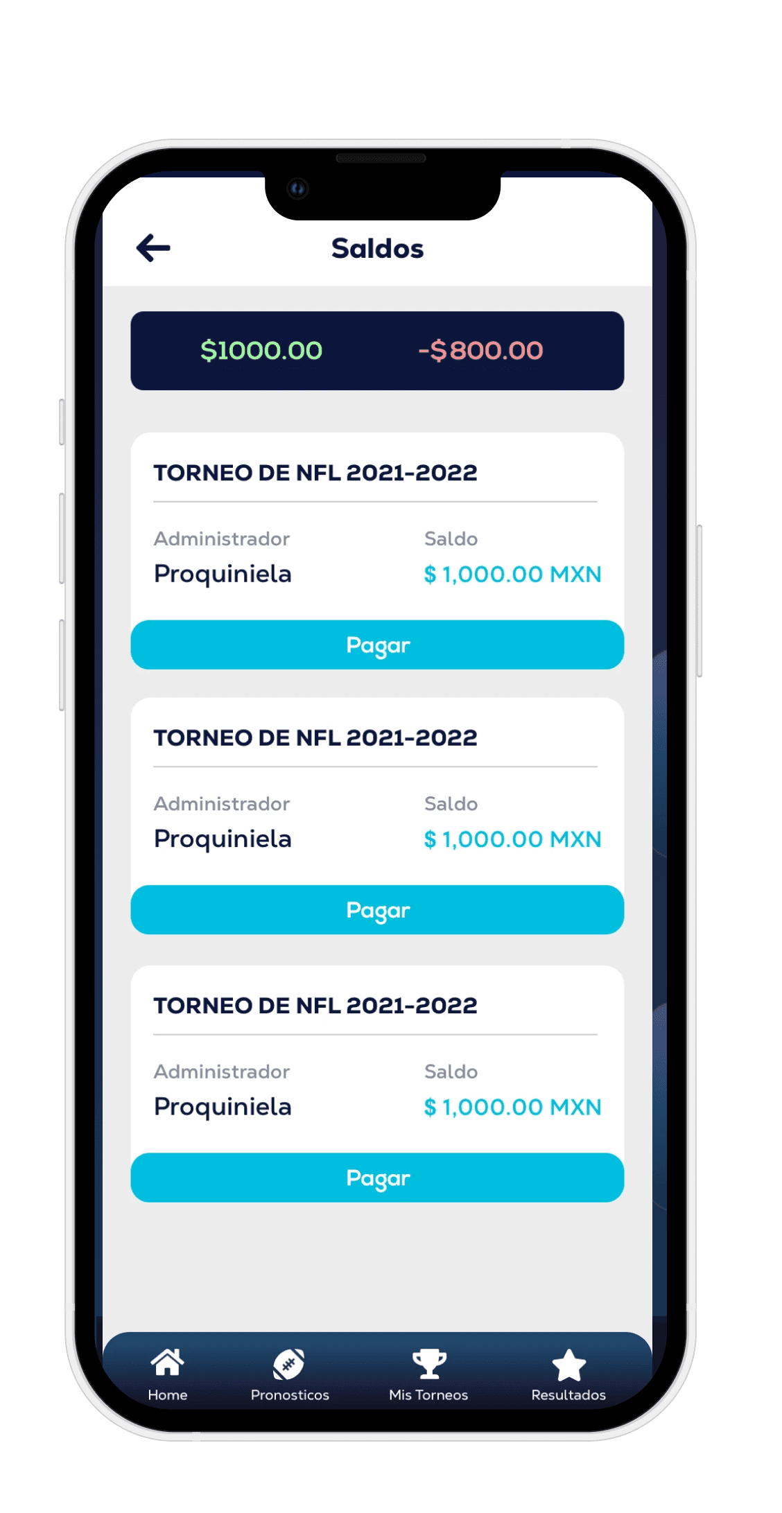
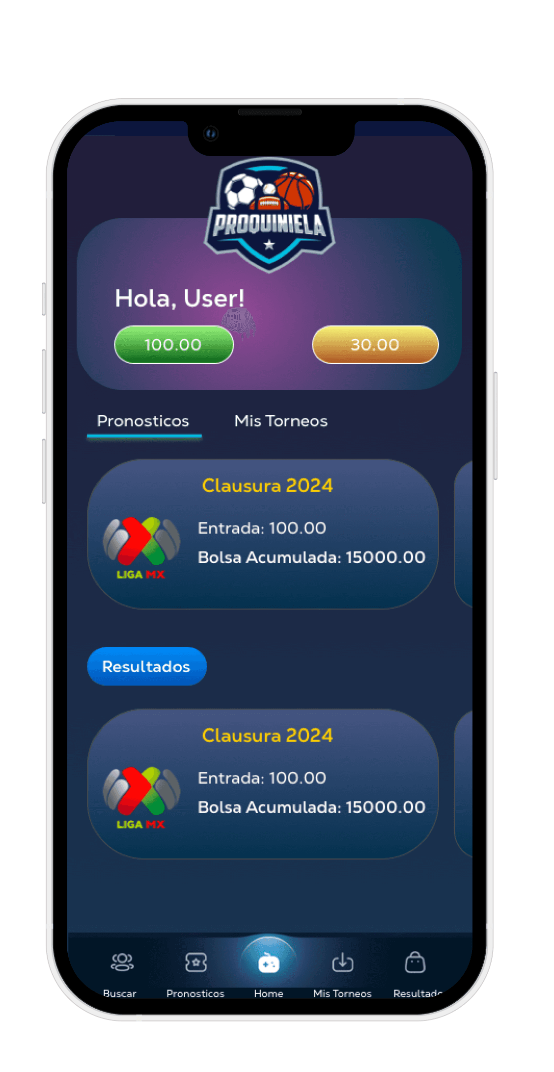
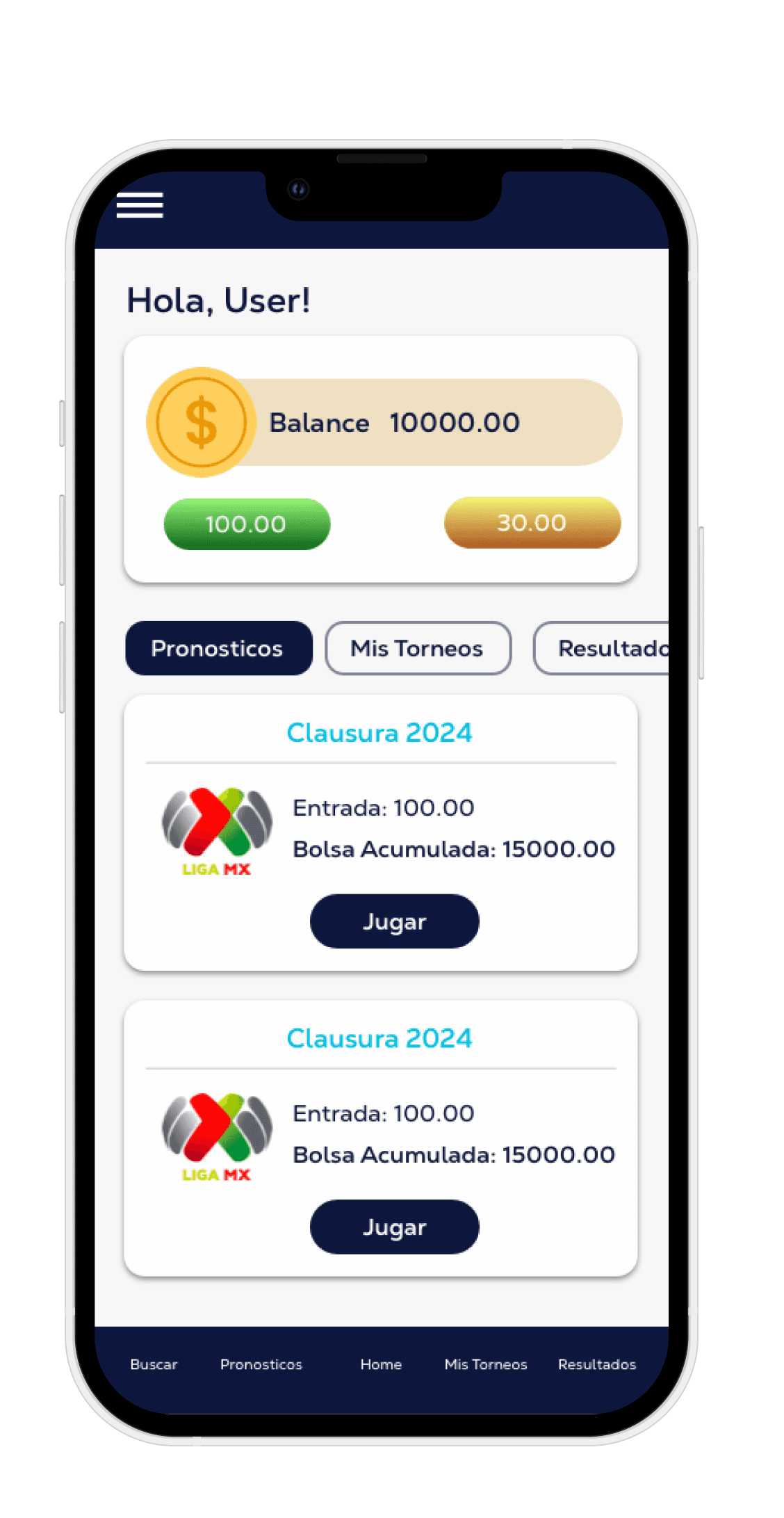
The final design met the project’s objectives by enhancing visual components and overall UI quality.
Improvements in color, typography, and UI elements increased visual appeal while supporting clearer, more intuitive user interactions.
GET IN TOUCH
Let’s work together
View More Projects
Get in Touch
About