⚡ Game Jam — 48 Hours Challenge
A complete UX/UI case study documenting the design process behind Before Losing, from first sketch to final screen in under two days.
Role
UX/UI Designer
Duration
48 Hours
Tools
Figma · Unity
Team
1 Designer · 2 Devs · 1 Illustrator
Scroll to explore the process
Project Overview
What Is Before Losing?
A game born from constraint — where every design pixel had to earn its place.
🎮
The Game
Before Losing follows a king on a quest to recover something he has lost. To uncover clues, he must face a series of mini-games set by different tribes.
⚡
The Jam
Built during a 48-hour game jam. Every design decision had to be fast, intentional, and tied directly to player experience.
🎯
Design Goal
Create an intuitive, visually striking UI that players could understand instantly, with zero onboarding friction and maximum emotional impact.
🛠️
Design Stack
Figma for wireframes and high-fidelity UI, Unity for implementation, collaborative real-time design with version-controlled assets.
01 — The Challenge
Design Under Pressure
A game jam strips away every comfort zone. The constraints aren't obstacles, they're the design brief. Here's what we were working with.
⏱️
48 Hours
Total design + dev time
👥
4 People
1 designer, 2 developers, 1 illustrator
🎲
1 Theme
Revealed at jam start
🚀
0 Assets
Built everything from scratch
Problem Statement
Players of fast-paced jam games often feel confused or overwhelmed by the UI in their first 10 seconds. We needed to design a complete visual system that communicated core mechanics instantly and emotionally, without the luxury of iteration cycles.
How Might We...
1
How might we create intuitive controls with almost zero tutorial time?
2
How might we communicate urgency visually without frustrating players?
3
How might we make loss feel motivating, not discouraging?
4
How might we build a complete UI system in under 8 hours?
02 — UX Process
Understanding the Player
Even in 48 hours, UX starts with empathy. We rapid-sketched personas and mapped the core player journey before touching Figma.
Rapid Personas
🏆
The Competitive Gamer
Age: 15–28
"I want to know immediately if I'm good at this."
Needs
✓
Instant feedback on performance
✓
Clear win/loss states
✓
Fast retry loop
Pain Points
✕
Confusing controls on first boot
✕
Too much text before gameplay
🌟
The Casual Explorer
Age: 16–35
"If it's not fun in 30 seconds, I'm out."
Needs
✓
Welcoming visual style
✓
Low barrier to entry
✓
Forgiving first experience
Pain Points
✕
Intimidating UI with no guidance
✕
Confusing UI
Core Player Journey
Full player flow from first launch to victory or retry, including the decision branch at step 04.
▶
01
Launch Screen
Logo + ambient + king story
🏛
02
Select a Tribe
Tribe cards + lore
📜
03
Tribe History
Background + stats
⚔
04
Attack / Diplomacy
Choose your strategy
↓ Choose path
⚔
5A
Attack Mode
Conflict battle game
🕊
5B
Diplomacy
Alliance strategy game
🏆
WIN
Get Prize
Victory reward
💀
LOSE
Try Again
Back to step 04
↩ Loop back to ⚔ / 🕊 choice
Linear path
Attack branch
Diplomacy branch
Lose → retry loop
⚡ Rapid Ideation
🗣️ Hallway Testing
📋 Heuristic Evaluation
🖊️ Paper Wireframes
🔄 Iterative Sketching
03B — Drafts & Sketches
From Sketch to Screen
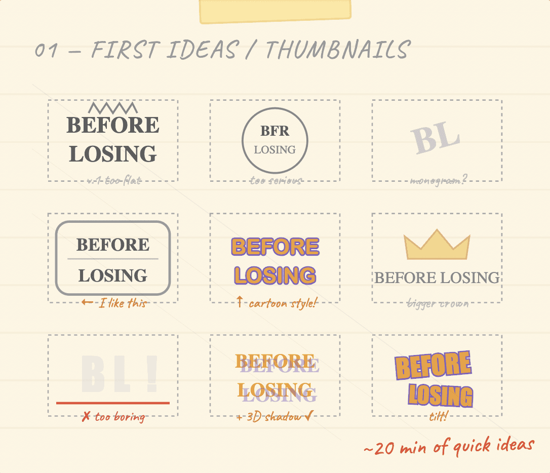
Every screen started as a rough sketch. These paper drafts and whiteboard diagrams capture the raw decision-making during the jam, before a single pixel was polished.
✏️
All sketches were done on paper or whiteboard in the first 6 hours. Timestamps next to each sketch show when in the 48h jam they were created. Hover a card to read the design note.
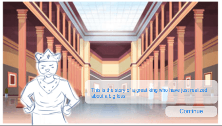
Main Menu
Hour 01:30
Paper Sketch
3 button hierarchy established early — Play must be visually dominant
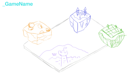
Select a Tribe
Hour 02:30
Paper Sketch v2
Card component with selection state — revised after team feedback session
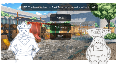
Attack / Diplomacy
Hour 03:15
Paper Sketch v1
Critical decision screen — red/green color coding for immediate affordance
🎨
From Paper → Figma → Unity
Each sketch was directly translated into a Figma frame. No extra rounds of digital wireframing — the jam forced us to go straight from paper sketch to hi-fi UI. This saved approximately 4 hours compared to our normal workflow.
03 — UI Design System
Building the Visual Language
Every component, color, and type decision reinforces the game's tension and tribal theme. Here's the design system we built in 8 hours.
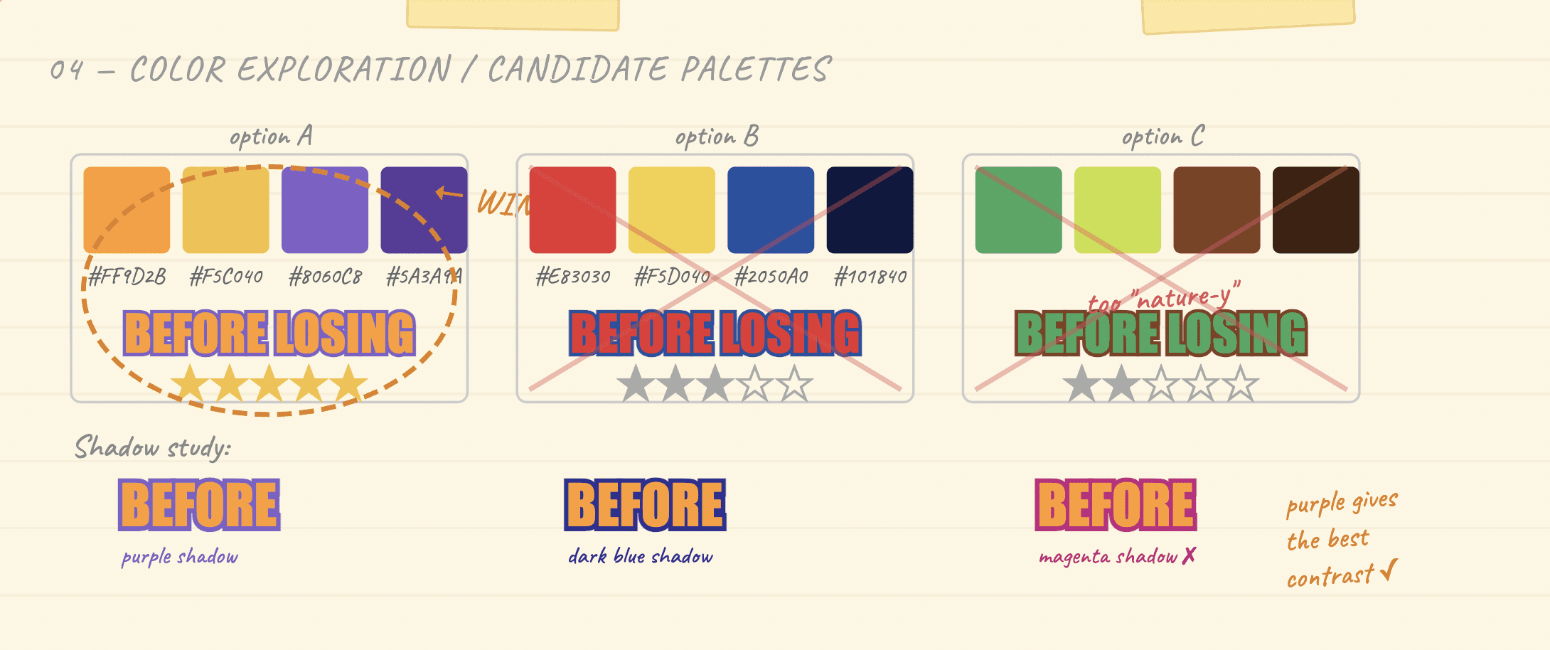
Color Palette
Deep Purple
#12022E
Background
Surface
#1E0A45
Cards & Panels
Vivid Orange
#F5A623
Primary Action
Royal Purple
#8B5CF6
Accent & Focus
Lavender
#C4A8F0
Body Text
Crown Gold
#F5C842
Highlights & Badges
Stone Blue
#2B7FD4
Button Primary
Stone Gray
#787878
Button Secondary
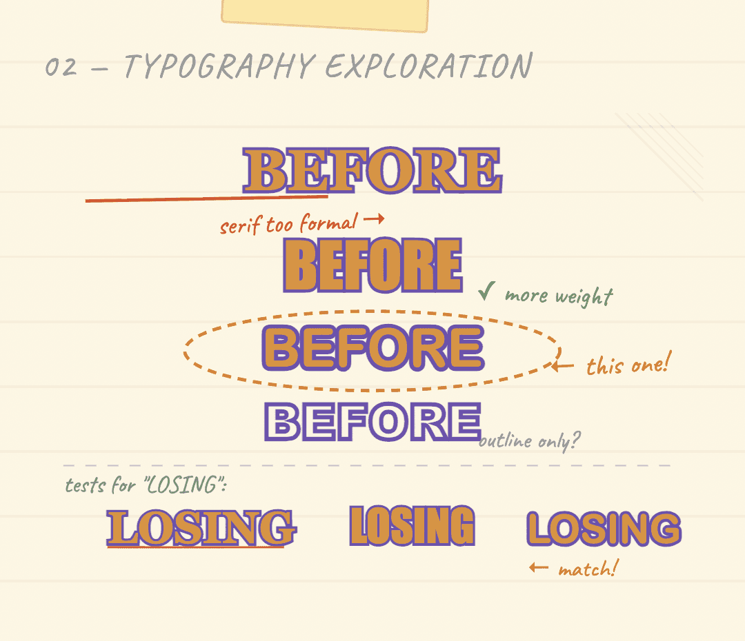
Typography System
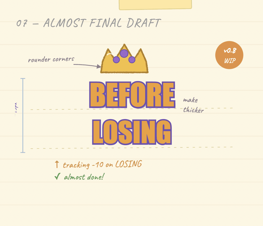
Logo Design
Game UI / Buttons
Buttons, action labels, game states
ATTACK
Lilita One
Display / Heading
Game titles, screen headers
Before Losing
Lilita One
UI Meta / Labels
Navigation, captions, metadata
SELECT YOUR TRIBE
Space Grotesk
Body / Descriptions
Descriptions, hints, tooltips
Make your move before the clock hits zero.
Nunito
Button Components
Stone-panel buttons with glossy tops, layered depth and corner crack decorations — built to match the game's hand-crafted tribal aesthetic.
Primary — Action Buttons (Blue Stone)


Hover over buttons to see the hover state (text darkens to black).
Secondary — Navigation (Gray Stone)


Contextual — Win / Lose

04 — 48hr Timeline
The 48-Hour Breakdown
How we allocated every hour — from raw idea to submitted game — with design and development working in parallel.
Time Allocation — 48 Hours Total
UI Design
Dev
Testing
Polish
💡
Kickoff & Concepting
⏱ 0–2h
✓ Game concept + design brief
Theme reveal & interpretation
Game concept brainstorming
Core mechanic lock-in
Team role assignment
🗺️
UX Research & Flows
⏱ 2–6h
✓ User flow map + wireframes
Rapid persona sketching
User flow diagram (paper)
Wireframe thumbnails
Heuristic evaluation planning
🎨
UI System Design
⏱ 6–14h
✓ Design system + 3 key screens
Color palette definition
Typography system
Button & control components
High-fidelity Figma frames
⚙️
Implementation
⏱ 14–30h
✓ Playable build with full UI
Asset handoff to devs
Real-time design QA
In-engine UI adjustments
Iterative feedback loops
🧪
Playtesting & Polish
⏱ 30–40h
✓ Polished build ready for submission
Internal hallway testing
UX issue triage
Visual refinements
Accessibility quick checks
🚀
Final Push & Submission
⏱ 40–48h
✓ Submitted! 🎉
Bug fixes & last polish
Store page screenshot prep
Case study documentation start
Game jam submission
05 — Reflections
What We Won & Learned
A game jam is a mirror for your design process. Here's what the 48-hour sprint revealed about how we design under pressure.
✅
What Worked Well
✓
Established a full design system (colors, type, components) in under 8 hours
✓
User flow was mapped before a single pixel was designed — saved significant rework
✓
The chunky cartoon button style was immediately recognized and loved by testers
✓
Constant dev-design syncing prevented late-stage UI breakage
🔧
What We'd Improve
!
Needed less time on game history and more on game usability.
!
Accessibility wasn't prioritized due to time — contrast ratios need revisiting post-jam
!
More user testing rounds would have caught the confusing timer UX earlier
!
Style integration needed more time, some graphics were a mismatch.
Key Design Learnings
⚡
Constraints Sharpen Decisions
With 48 hours, every design choice had to be justified immediately. This built our design reasoning muscle faster than any normal sprint.
🗺️
UX Before UI — Always
Sketching the user flow first meant the UI had a clear purpose. We never designed a screen that didn't serve a user need.
🤝
Real-Time Dev Collaboration
Designer-developer pairing in real-time (not handoff) eliminated the translation gap. What we designed, shipped, accurately.
🎨
Visual Identity = Trust
A strong, consistent visual language made the game feel polished even when mechanics weren't fully refined. Players forgive bugs less when the UI is inconsistent.
Design Fast. Design Smart.
Before Losing taught us that great UX/UI doesn't require unlimited time — it requires clarity of purpose, fast decision-making, and a tight feedback loop between design and development.
About